wHO IS TECHNIKON
Sometimes, to explain something complex, you have to think simple.
The CHALLENGE
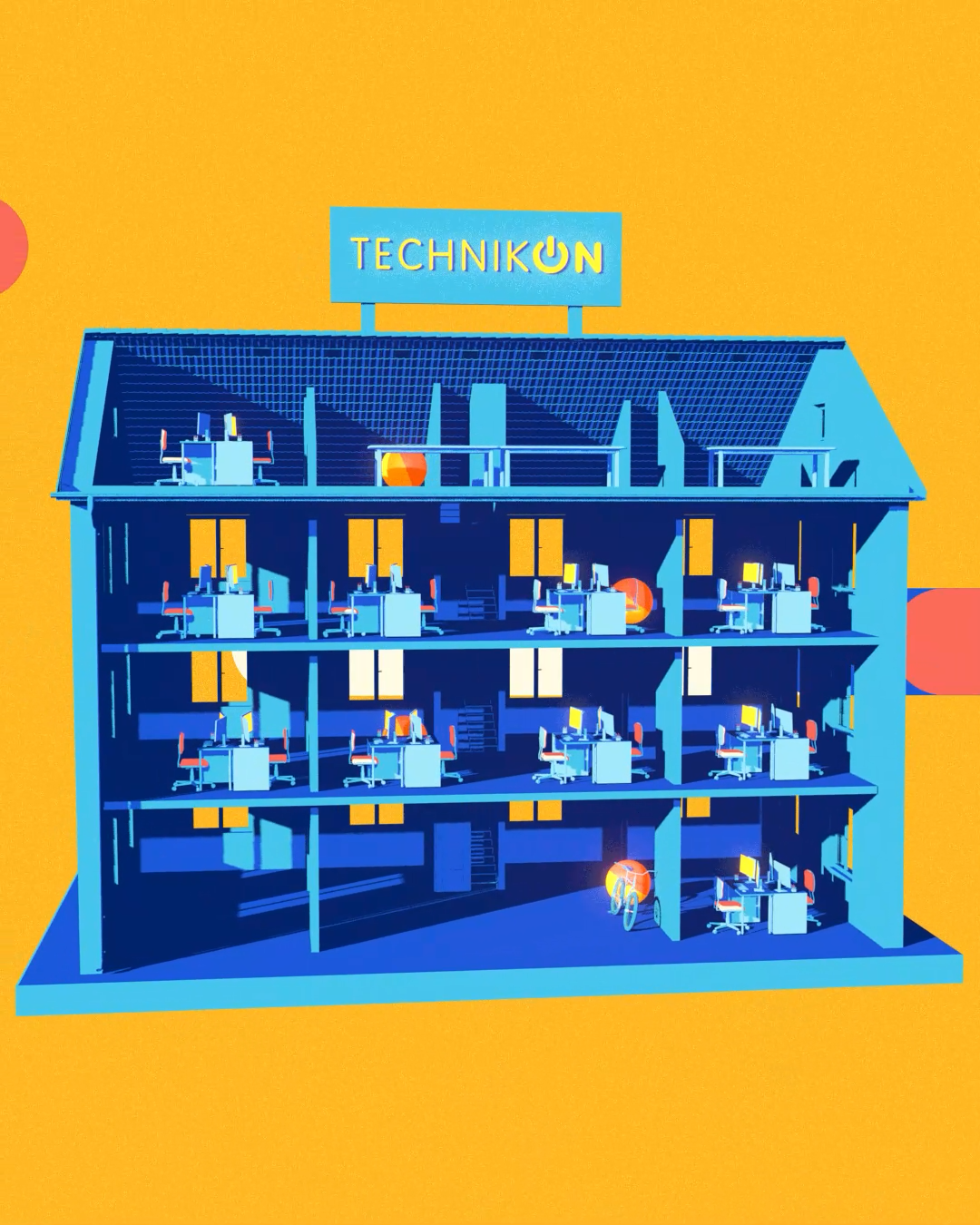
TECHNIKON needed a simpler and friendlier way to explain who they are and what they do to a broader audience beyond research partners and industry professionals.
We wanted to make complex topics, processes and terminology easier to understand for people unfamiliar with the world of research projects, calls or Gantt charts.
THE NEEDS
The project also created an opportunity to explore a more approachable visual direction for the brand. While keeping TECHNIKON’s existing logo and blue identity, the goal was to introduce new colours and visual variations that could naturally expand its visual language.
THE SOLUTION

To solve the challenge, I went back to something simple: the circle. A basic, abstract shape with endless possibilities, able to transform, connect and adapt to different ideas.
From there, I built the visual language of the video around shape, colour and motion. TECHNIKON’s established blues were joined by vibrant oranges and yellows, bringing warmth and energy to the brand. What started as an exploration for this video eventually became part of TECHNIKON’s broader visual communication.
In the end, a simple shape became the foundation for a new way of telling TECHNIKON’s story.